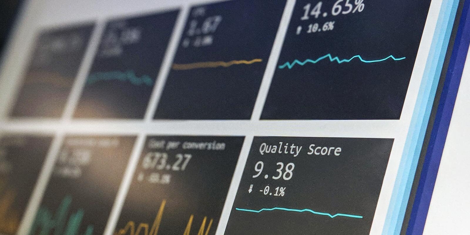
Goodbye, Ambiguity: Data-Driven Decision Making with Data Visualization
Maybe you’ve been here before: you need to make a critical business decision, but you don’t have a reliable source of data you can use for drawing conclusions. Whether the data at your organization is unstructured, inaccurate, inconsistent with other sources, or simply missing, you can’t possibly make a confident decision. You’re stalled, and maybe in disagreement with other leaders about the facts and next steps.
This kind of ambiguity can be frustrating at best, toxic at worst. You can lose out on revenue, overspend on budget, and waste valuable time just attempting to get the facts straight among stakeholders.
In our experience, many companies may only need to make a few small adjustments to remove this kind of decision ambiguity — and it starts with setting yourself up with a data-driven decision making tool.
Examples of Data-Driven Decision-Making
Data-driven decision making (DDDM) is the process of using business intelligence to align strategic decisions with your goals and initiatives. What are some of the questions you can answer with data-driven decision-making? Here are a few examples:
Determining how many front-end developers you need for a project
Finding the best time to schedule virtual training sessions
Scoping out the length of a development cycle based on given resources
Adjusting marketing strategies based on campaign ROIs
If you’re a business decision maker, your challenge may be similar to one of the above or completely unique. Regardless of your role and function, you know you need DDDM — but how do you leverage the data you already have? How can you be sure you’re looking at the right data, and that you’re interpreting it correctly? How can you compare multiple datasets at a glance and draw meaningful conclusions?
One strategy that we’ve seen help with challenges like this is to use a data visualization tool.
A Data Visualization Strategy
When it comes to data-driven decision making strategies, nothing beats data visualization because it provides anyone, from data scientist to data dabbler, a direct understanding of what’s happening in the business.
Data visualization isn’t just about creating dashboards with pretty colors or branded imagery. It’s about creating a readable, interactive user experience that delivers the exact information the user needs with minimal hassle.
Fortunately, most data visualization programs have this functionality built-in. These programs enable you to use your existing data to sort facts from falsehoods, compare data sets, and more — all at a glance. Here are some of the leading data-driven decision making tools on the market, and a little bit about the benefits of each.
Microsoft Power BI is one of the most powerful data visualization tools out there, with users ranking its ease of use, setup, and quality of support as top-notch. It connects with a variety of other tools and provides company-wide collaboration, and works well for both SMBs and enterprise organizations.
Tableau Software is a comprehensive business intelligence tool that combines BI with visualization and an intuitive user interface (UI). While Tableau comes at a higher price point than Power BI, data analysts find it to be more geared toward their needs than the general business user.
Oracle Analytics is an AI-powered data solution providing robust reporting and dynamic visualization. This tool has powerful analytics capabilities and is powered 100% on the cloud. If you are looking for an alternative web-based BI dashboard, Oracle may be a worthy option to consider.
Statistical Analysis Using DDDM Tools
Once you’re using a business intelligence tool to visualize your data, how can you implement a repeatable DDDM strategy that helps remove ambiguity in decision-making? Here are a few suggestions.
Prioritize your objectives and meet with stakeholders. Which items are business-critical, and which are lower priorities? Which other players will be involved in your decision-making process and what matters most to them?
Visualize the right data. Locate the business intelligence related to your key objectives and focus your dashboard on these metrics.
Analyze the data with other leadership. Each stakeholder brings his or her own insights and abilities to the table, so you’ll get the clearest picture when you compare ideas and observations.
Make a decision based on the existing business intelligence. Lay the foundation of your action plan — what needs to happen next? Break this down into tangible milestones and communicate them with your team.
Continue to measure performance and relevant metrics after implementing your decision. DDDM doesn’t happen once, rather, it’s an ongoing process that improves with time. Track key metrics on your dashboard to objectively measure performance as you launch your new objectives and make adjustments over time.
Defying Ambiguity With a Single Source of Truth (SST)
We can’t emphasize enough the importance of building a Single Source of Truth (SST) in data before you attempt to implement data-driven decision-making. Without this at the core of your strategy, you’ll still be playing the guesswork game.
That is why having a BI tool that allows you to visualize data is so critical. Think how much easier scheduling will be if you can see everyone’s performance at a glance, or whether your new marketing campaign is performing, or if you’re overspending on a specific project.
At Prime 8 Consulting, we strive to help our clients get the most out of data. We’ll help you implement robust tools that target and use the right data to take the guesswork out of the equation. Reach out to bi@prime8consulting.com to explore how we can help.


